
- PackagingPrimary deliverable
- 2Custom typefaces
The problem
Cosmetics packaging is judged on a shelf, next to competitors, in under two seconds. The identity had to be recognisable at that distance and still reward a closer look.
What I did
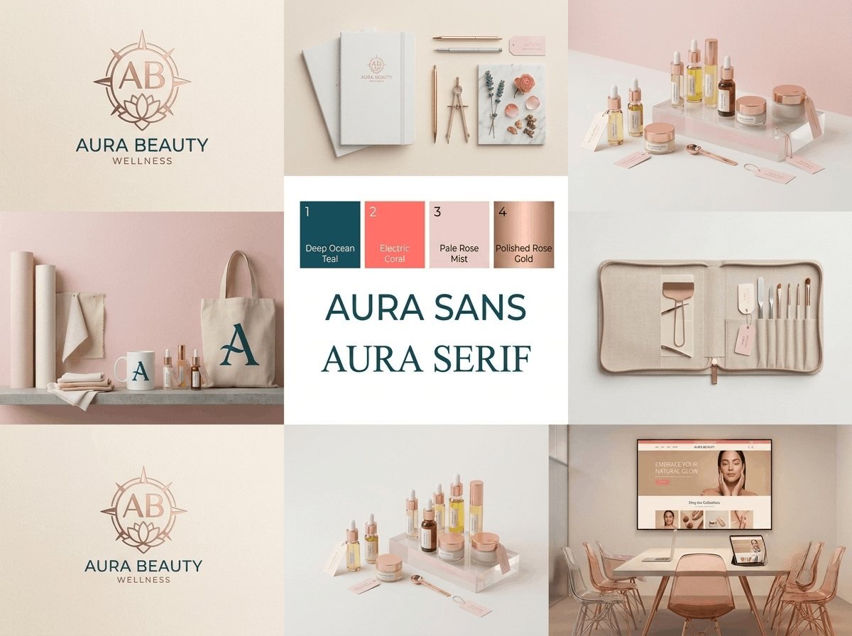
- AB monogram in a high-contrast serif
- Blush, cream and soft gold palette
- Custom type pairing: Aura Sans with Aura Serif
- Primary and secondary packaging
- Retail interior and social templates
The brief
Brand identity and packaging for a cosmetics line. Cosmetics is decided on a shelf, in about two seconds, against competitors doing the same thing.
The shelf test
That two-second window governs everything. The identity has to be recognisable at three metres, distinguishable from its neighbours, and still reward a closer look once picked up.
Those pull in different directions: what reads at distance is bold and simple, what rewards inspection is fine and detailed. The resolution is hierarchy — a strong monogram carrying the distance recognition, with finer typography and material detail that only becomes apparent in the hand.
The mark
An AB monogram in a high-contrast serif. High contrast is a risk at small sizes, where thin strokes disappear, so the monogram was drawn rather than set, with the thin strokes thickened enough to survive printing on a curved surface.
Palette
Blush, cream and soft gold. Conventional for the category, and deliberately so: cosmetics packaging that ignores its category conventions is not read as innovative, it is read as belonging to a different category.
The differentiation comes from execution rather than from palette. Gold is specified as a foil rather than as printed ink, which is more expensive and immediately visible on a shelf.
Typography
Aura Sans with Aura Serif, a custom pairing. Cosmetics packaging carries a lot of small legal text — ingredients, warnings, volumes — and that text has to be legible at 5pt on a curved surface. Most display faces cannot do it, which is why the pairing includes a face chosen specifically for that job.
Packaging
Primary and secondary, specified with substrate and finish rather than as artwork alone. A finish left unspecified is chosen by the printer.
Retail and social
Interior treatment and social templates using the same system, so the brand a customer meets online is the one that arrives in the box.
What was delivered
Logo suite, custom type pairing, primary and secondary packaging artwork, material and finish specifications, retail and social templates, and usage guidelines.
The stack
Next
More case studies
-
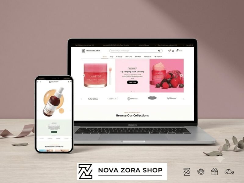
Nova Zora Shop
A WooCommerce store for authentic K-Beauty and skincare brands, built around category navigation and conversion.
-
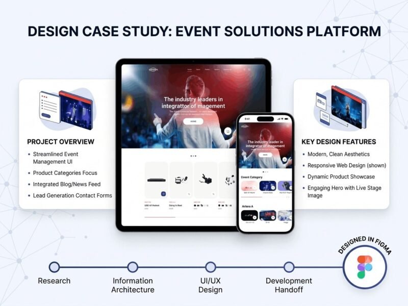
ABBN
A corporate site for a conference interpreting-equipment supplier, with a storefront and a full solutions site…
-
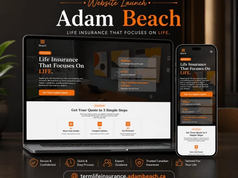
Adam Beach Term Life
A landing page for a Canadian term life insurance advisor, built around a three-step quote flow.
Ready to build something that performs?
Tell me about your project and I'll tell you exactly how I'd approach it. Free 30-minute consultation, and I reply within 24 hours.