
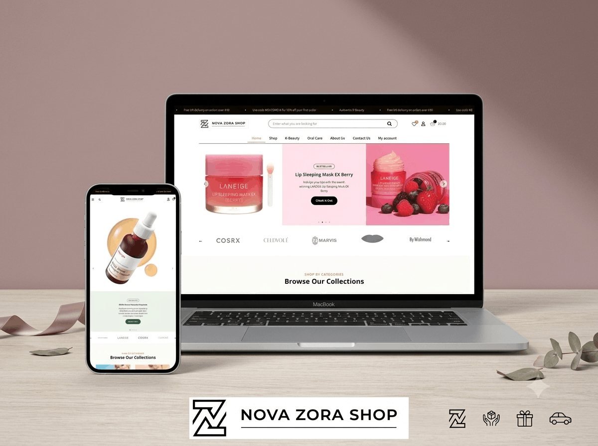
- 4Shop categories
- K-BeautyProduct focus
- WooCommercePlatform
The problem
The brand carried LANEIGE, COSRX and Celdyole but had no storefront that let shoppers browse by the way they actually think about skincare.
What I did
- Built a WooCommerce store for authentic K-Beauty and skincare brands|Category navigation across K-Beauty, Oral Care, Beauty and Personal Care, and Eye Care|Promo banner, wishlist and cart UX designed around conversion|Fully responsive, mobile-first shopping experience
The brief
K-Beauty is a category built on sequence. A customer is not buying one product, they are assembling a routine, and the order matters: cleanser, toner, essence, serum, moisturiser, sun protection. A store that presents those as an undifferentiated grid asks the customer to already know what they are doing, and most do not.
What makes this category difficult
Three things, all of which shape the build.
First, ingredient transparency. K-Beauty buyers read labels. They search for specific actives and avoid specific irritants. That means ingredient data has to be structured and filterable, not buried in a paragraph of prose that nobody can search.
Second, routine building. Someone new to the category needs to understand what goes where. Someone experienced needs to find a single replacement product quickly. The same navigation has to serve both, which usually means two routes into the catalogue rather than one.
Third, trust. Counterfeit product is a real problem in this category, and buyers know it. Authenticity has to be visible without turning every page into a disclaimer.
How the store is built
WooCommerce, with the catalogue architecture designed before a single product was added. Four top-level categories map to how customers actually shop rather than how a supplier organises a warehouse, and product attributes carry skin type, concern and key active as structured data so filters work on the things buyers care about.
Product templates lead with what the item does and who it suits, then the full ingredient list, then reviews. That order is deliberate: the decision is usually made in the first screen, and burying the ingredient list below reviews means the buyer who cares most has to scroll past the least specific information to reach the most.
Performance
Beauty stores are image-heavy by nature, and images are where most WooCommerce sites lose their speed. Every product image is served as WebP with a correctly sized fallback, dimensions are set in the markup so nothing shifts as the page loads, and only the images above the fold load eagerly.
The category pages use server-side filtering rather than a JavaScript filter over the whole catalogue. That keeps the page fast as the range grows, and it means each filtered view has a real URL that can be linked, shared and indexed.
Checkout
Guest checkout is on, and it is not hidden behind a login prompt. Forcing account creation is the single most reliable way to lose a first-time customer, and the account can be offered after the order is placed, when the customer has a reason to want one.
Shipping cost appears before the checkout begins rather than at the final step. An unexpected shipping charge at the last screen is the most common reason a cart is abandoned, and showing it early costs a few sales while saving many more.
What the client can manage
Everything that changes: products, categories, banners, the featured collection on the homepage. Nothing that would break the layout. Product data lives in labelled fields with sensible defaults, so adding a new item is filling in a form rather than rebuilding a page.
The stack
Next
More case studies
-
ABBN
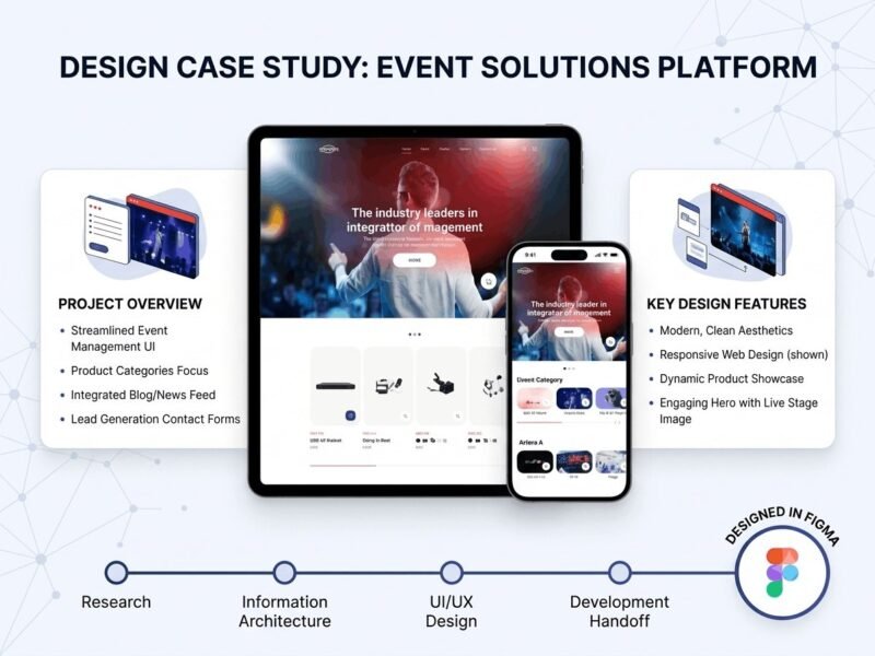
A corporate site for a conference interpreting-equipment supplier, with a storefront and a full solutions site…
-
Adam Beach Term Life
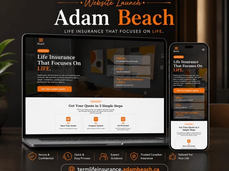
A landing page for a Canadian term life insurance advisor, built around a three-step quote flow.
-
Our Man in Vienna
A travel and city-experience guide site for Vienna, structured for storytelling and bookings.

Ready to build something that performs?
Tell me about your project and I'll tell you exactly how I'd approach it. Free 30-minute consultation, and I reply within 24 hours.