
- CompassPrimary mark
- 2Typefaces
- Print + digitalDelivered for
The problem
A property developer needs an identity that reads as established rather than new. The mark has to work at the size of a signboard and the size of a favicon, and hold up in print on stationery a buyer will actually handle.
What I did
- Compass mark drawn as a single-weight line, so it stays legible when reduced
- Deep green and cream palette, chosen for print as well as screen
- Avenir Next paired with Bodoni 72 for headings
- Stationery, signage, brochure and app screen mockups
- Usage guidelines covering minimum sizes and clear space
The brief
A brand identity for a real estate and development company. Property development is a category where a new entrant has to look established, because buyers are committing large sums to something that does not exist yet.
The mark
A compass, drawn as a single line weight. Property marks tend towards buildings and rooflines, which is literal and crowded; a compass carries direction and permanence without illustrating the product.
Single line weight is a practical decision as much as an aesthetic one. A mark with varied stroke widths breaks down at small sizes, and this one has to work as a favicon, embroidered on a polo shirt, and four metres wide on a hoarding.
Palette
Deep green and cream. Green in property usually signals environmental credentials; here it is doing something different, reading as established and land-connected rather than as a sustainability claim the company has not made.
The palette was specified for print first. A colour chosen on screen and converted afterwards produces the muddy result that makes printed collateral look cheap next to the website.
Typography
Avenir Next with Bodoni 72. A geometric sans for information and a high-contrast serif for display: the pairing gives headings authority while keeping specifications and figures clean.
Both are widely licensed and available, which matters. A brand built on a typeface the client cannot license is a brand they will abandon within a year.
Applications
Stationery, signage, brochures, packaging and digital. The mark was tested in each before the identity was signed off, because a logo that works in a presentation and fails on a site board has not been finished.
Guidelines
Minimum sizes, clear space, permitted colourways and what not to do. The last of those is the section that actually gets used, because most identity damage comes from well-meant improvisation rather than from ignorance.
What was delivered
Logo suite in all formats, colour specifications for screen and print, type licensing notes, application artwork and the usage guidelines.
The stack
Next
More case studies
-
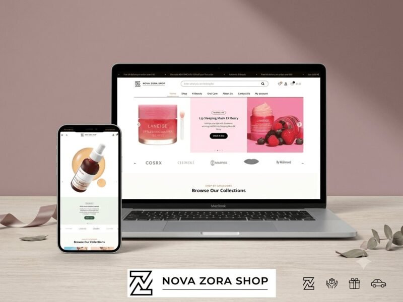
Nova Zora Shop
A WooCommerce store for authentic K-Beauty and skincare brands, built around category navigation and conversion.
-
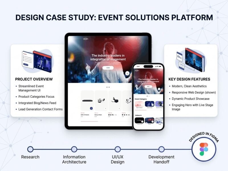
ABBN
A corporate site for a conference interpreting-equipment supplier, with a storefront and a full solutions site…
-
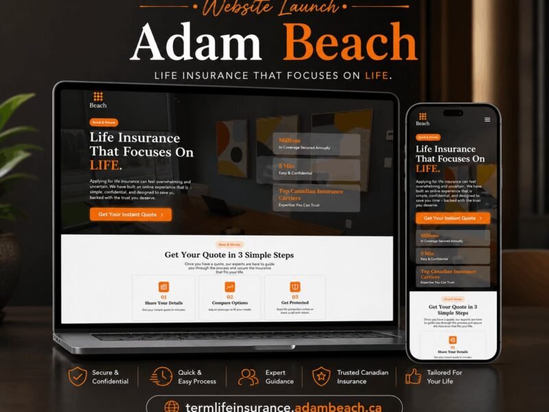
Adam Beach Term Life
A landing page for a Canadian term life insurance advisor, built around a three-step quote flow.
Ready to build something that performs?
Tell me about your project and I'll tell you exactly how I'd approach it. Free 30-minute consultation, and I reply within 24 hours.