
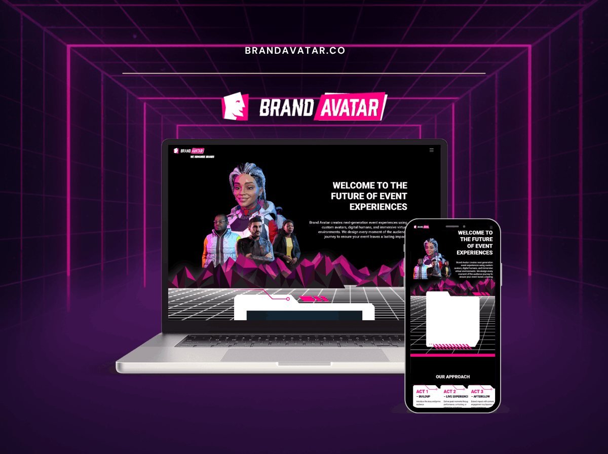
- BrandingAgency site
- PortfolioStructure
The problem
A studio selling futuristic event experiences needed a site that demonstrated the aesthetic rather than describing it.
What I did
- Website for a next-generation event experience studio using custom avatars and digital humans|Bold neon cyberpunk visual identity with 3D character artwork|Our Approach structured as a three-act journey: Buildup, Live Experience, Afterglow|Fully responsive with a matching mobile layout
The brief
A branding agency’s own site. The same trap as any studio site: the work has to carry it, and the site itself is judged as work.
The portfolio problem
Most agency portfolios are a grid of images with a client name underneath. That shows what was made and says nothing about why, which means it demonstrates execution and not thinking.
For a branding agency that is the wrong half. Clients buy strategic judgement; the visual outcome is evidence of it. Each project therefore carries the problem, the reasoning and the outcome, with the imagery supporting the argument rather than replacing it.
Design that is confident without competing
A branding site has to demonstrate taste while staying out of the way of the work, which pull in opposite directions.
The resolution here is a dark, restrained frame that makes colour-led brand work sit forward, with typography that is considered but not loud. The site reads as designed without any single element asking to be noticed, which is roughly what a branding agency should be demonstrating.
Motion
Used sparingly and only on arrival at a section. Motion on a design agency site is a claim about craft, and clumsy motion undermines that claim more effectively than none at all. Everything respects the reduced-motion preference, which is itself part of the craft.
Case study structure
Problem, approach, outcome, in that order, on every project. Consistency matters more than variety here: a prospect reading three case studies wants to compare them, and three different structures make that work.
The build
WordPress with projects as structured content: client, sector, disciplines, and a gallery. Filtering by discipline lets a prospect looking for packaging work find it without reading through identity projects.
Performance
An image-heavy portfolio is easy to build slowly, and a slow design site is an argument against its own author. Images are served at display size in modern formats, galleries load progressively, and the site carries two stylesheets and one deferred script.
What the client can manage
Projects, galleries, disciplines and the studio pages. Adding a project creates its case study and places it in the relevant filters.
The stack
Next
More case studies
-
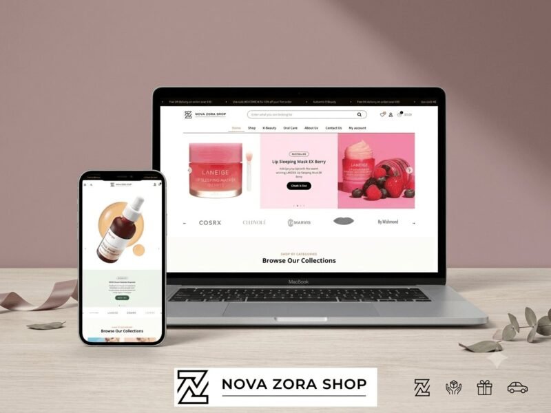
Nova Zora Shop
A WooCommerce store for authentic K-Beauty and skincare brands, built around category navigation and conversion.
-
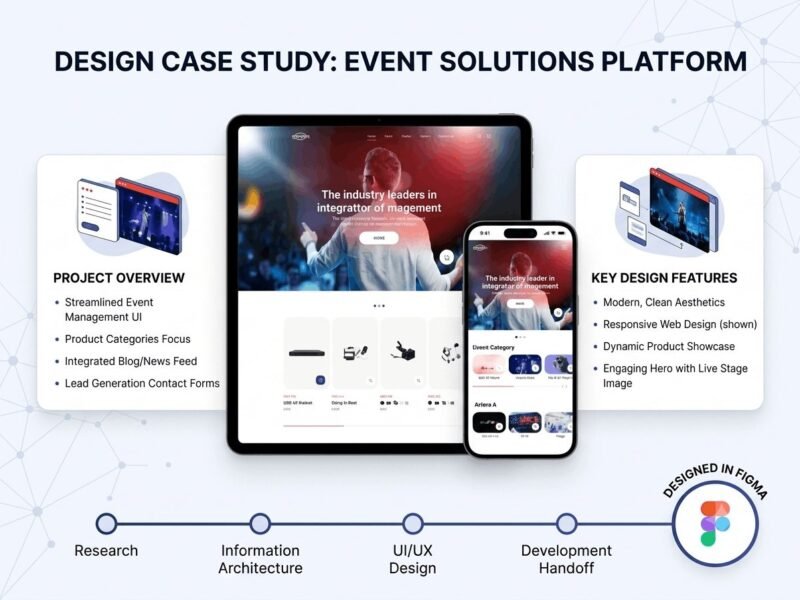
ABBN
A corporate site for a conference interpreting-equipment supplier, with a storefront and a full solutions site…
-
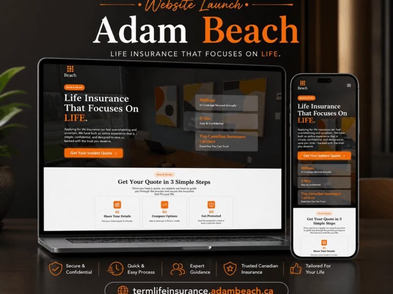
Adam Beach Term Life
A landing page for a Canadian term life insurance advisor, built around a three-step quote flow.
Ready to build something that performs?
Tell me about your project and I'll tell you exactly how I'd approach it. Free 30-minute consultation, and I reply within 24 hours.