
- 2Languages
- Course finderKey feature
- BookingPrimary action
The problem
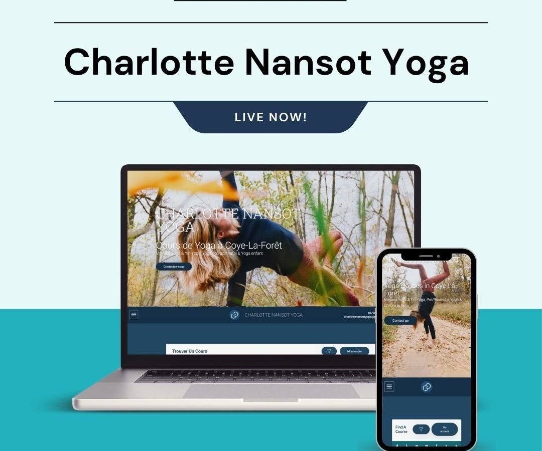
Two languages and a class booking system had to coexist without the site feeling like two sites.
What I did
- Bilingual French and English booking website for a yoga instructor|Full-bleed action photography with a calm, editorial dark-navy footer|Course finder and account booking system for class sign-ups|Fully responsive with a matching mobile layout
The brief
A yoga practice teaching in French and English, with courses and a booking system. Bilingual from the start rather than translated afterwards, which is a meaningfully different build.
Bilingual done properly
Most bilingual sites are a primary language with a second bolted on: a translation plugin, a flag in the corner, and a second version that quietly falls behind.
Here both languages are equal. Content is structured so every piece has both versions in the same record, which makes an untranslated item visible in the admin rather than silently missing on the front end. Language selection persists across pages, and each language has its own URL so a French page can be shared and indexed as French.
That last point is the one most often missed. A site that serves both languages from the same URL is invisible in one of them.
The course finder
Yoga students choose on level, style, time and language, and a class list that cannot be filtered on those forces every visitor to read everything.
The finder filters on all four. Level and style are structured fields, not tags, so a beginner filtering for beginner classes gets a reliable answer rather than whatever was labelled consistently.
Booking
Class capacity is real, so the booking has to reflect it. A full class shows as full rather than accepting a booking that has to be apologised for later. Recurring courses and drop-in classes are handled differently, because a student committing to eight weeks is making a different decision from one booking a single session.
Design
Calm, spacious and image-led, with photography of actual classes rather than stock. Stock yoga photography is instantly recognisable and it makes a practice look like a franchise.
Typography is set generously. A site about slowing down that crowds its own text is arguing against itself.
The build
WordPress with classes, courses and instructors as structured types, each carrying both language versions, level, style and schedule.
Accessibility
Yoga attracts students managing injury, age and mobility differences, so accessibility is not an abstraction here. Contrast is tested, everything works by keyboard, and class descriptions state physical requirements plainly rather than assuming.
What the client can manage
Classes, courses, schedule, instructors and both languages, from one screen per item.
The stack
Next
More case studies
-
Nova Zora Shop
A WooCommerce store for authentic K-Beauty and skincare brands, built around category navigation and conversion.
-
ABBN
A corporate site for a conference interpreting-equipment supplier, with a storefront and a full solutions site…
-
Adam Beach Term Life
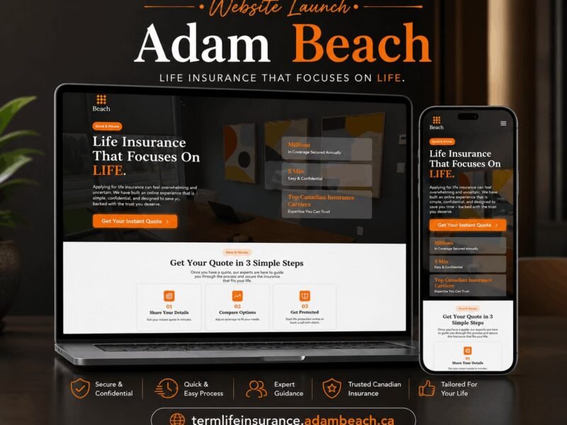
A landing page for a Canadian term life insurance advisor, built around a three-step quote flow.

Ready to build something that performs?
Tell me about your project and I'll tell you exactly how I'd approach it. Free 30-minute consultation, and I reply within 24 hours.