
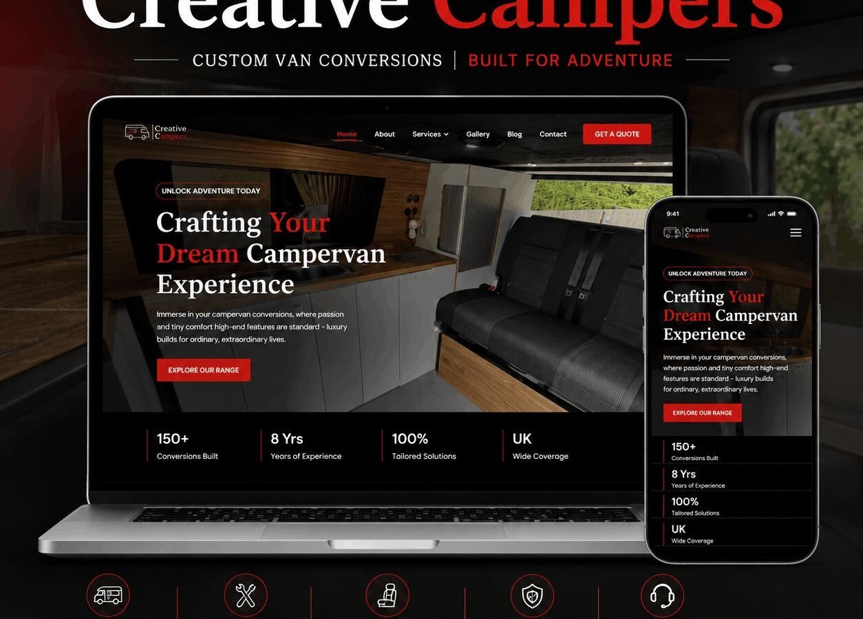
- 150+Conversions built
- DarkPhotography-led build
The problem
Custom van conversions are a high-consideration purchase and the existing site did not signal the craft involved.
What I did
- Website for a custom campervan conversion company|Dark, moody photography-led design for a premium feel|Stats bar: 150+ conversions built, 8 years experience, UK-wide coverage|Get a Quote and Explore Our Range dual CTAs
The brief
Creative Campers converts vans into campervans to order. Every build is different, the process takes months, and the customer is spending a significant sum on something they cannot see until it exists.
The trust problem
This is the defining challenge of the sector. A customer is being asked to pay a deposit on a vehicle that will be built to a specification agreed in conversation, by a company they found online, over a timeline measured in months.
Everything on the site follows from that. The gallery is of completed builds with enough detail that a visitor can see the standard of the work: joinery close-ups, wiring, the parts of a conversion that are hidden once the panels go on. Those images do more for trust than any amount of copy, because they are the things a customer worries about and cannot inspect.
The process is laid out step by step with what happens at each stage and what the customer is asked to decide. Ambiguity about process is what makes a large purchase feel risky.
Configuration without a configurator
A full configurator is the obvious answer and usually the wrong one for a bespoke builder. It implies a fixed menu of options, which is exactly what a custom conversion is not, and it sets an expectation of an instant price that a bespoke quote cannot meet.
Instead the site presents the decisions a customer will face — layout, sleeping arrangement, off-grid capability, interior finish — as a guide rather than a form. The enquiry then arrives with the customer having thought about the right things, which makes the first conversation productive rather than exploratory.
Photography-led design
The layout is dark, so that photographs of van interiors carry the page. Van interiors are small, warm-toned spaces, and they read better against a dark surround than against white, where the image edges compete with the page.
Type is kept out of the way. On a site where the product is visual, elaborate typography is competition rather than support.
The build
WordPress with conversions as their own type, each carrying the base vehicle, the layout, the notable features and a gallery. That structure means the gallery can be filtered by layout or by vehicle, which is how a prospective customer actually browses: they are looking for something close to what they want.
Performance
An image-led site is easy to build slowly. Galleries load progressively, images are sized for their display width rather than uploaded at full resolution and scaled in the browser, and the hero image on each page is preloaded so the first thing a visitor sees arrives quickly.
What the client can manage
Conversions, galleries, the process steps and pricing guidance. Adding a completed build is uploading photographs and filling in the specification.
The stack
Next
More case studies
-
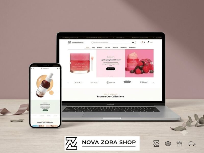
Nova Zora Shop
A WooCommerce store for authentic K-Beauty and skincare brands, built around category navigation and conversion.
-
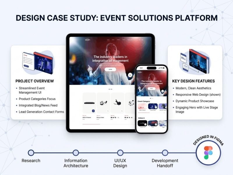
ABBN
A corporate site for a conference interpreting-equipment supplier, with a storefront and a full solutions site…
-
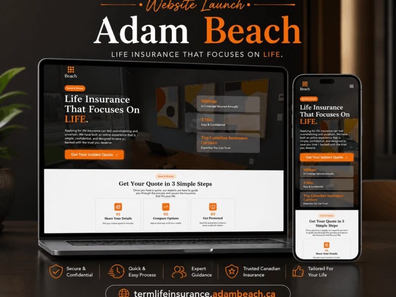
Adam Beach Term Life
A landing page for a Canadian term life insurance advisor, built around a three-step quote flow.
Ready to build something that performs?
Tell me about your project and I'll tell you exactly how I'd approach it. Free 30-minute consultation, and I reply within 24 hours.