
- NavySingle colour
- MerchApplied to
The problem
A coaching brand lives on merchandise and social, so the mark had to survive embroidery on a tote and a 40-pixel profile picture with equal clarity.
What I did
- Wordmark with an arrow built into the letterforms
- Single navy and white palette, so it embroiders and prints cheaply
- Repeating arrow pattern for packaging and tote bags
- Mug, tote, phone and stationery mockups
- Profile-picture lockup tested at 40px
The brief
Identity and merchandise system for a coaching and productivity brand. Brands in this space live on merchandise and social media, which constrains the design more than a conventional identity.
Designing for the constraints
A mark that will be embroidered on a tote and used as a 40-pixel profile picture cannot rely on fine detail, gradients or more than one or two colours. Embroidery in particular flattens anything subtle.
Those constraints were the starting point rather than a later compromise. The mark was designed at small size first and scaled up, which is the reverse of the usual process and produces something that works everywhere rather than something that works large and is redrawn for small.
The mark
An arrow built into the letterforms of the wordmark rather than placed beside them. That makes the wordmark self-contained: there is no separate icon to be used inconsistently or dropped when space is tight.
Palette
Navy and white. One colour, deliberately. Single-colour identities embroider cheaply, print cheaply, and reproduce identically across every supplier, which for a brand whose growth depends on merchandise is a commercial decision as much as an aesthetic one.
The pattern
A repeating arrow derived from the mark, used on packaging, tote linings and social backgrounds. It gives the brand presence on large surfaces without enlarging the logo, which is the usual and least elegant solution.
Applications
Mugs, totes, notebooks, stationery and digital, each mocked up before sign-off. A mark that has not been seen on the products it will live on has not been tested.
The profile-picture test
Rendered at 40 pixels and checked for legibility. For a brand whose primary channel is social, the profile picture is the most-seen application by a wide margin and is routinely the least considered.
What was delivered
Logo suite, pattern system, merchandise artwork, social templates and usage guidelines.
The stack
Next
More case studies
-
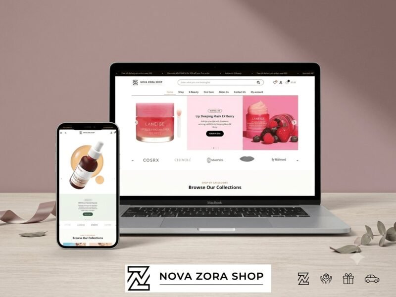
Nova Zora Shop
A WooCommerce store for authentic K-Beauty and skincare brands, built around category navigation and conversion.
-
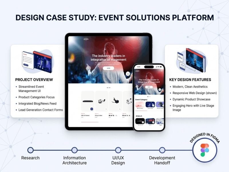
ABBN
A corporate site for a conference interpreting-equipment supplier, with a storefront and a full solutions site…
-
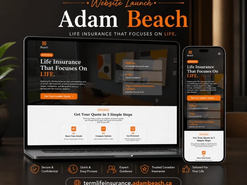
Adam Beach Term Life
A landing page for a Canadian term life insurance advisor, built around a three-step quote flow.
Ready to build something that performs?
Tell me about your project and I'll tell you exactly how I'd approach it. Free 30-minute consultation, and I reply within 24 hours.