
- 2Calls to action
- EditorialDesign direction
The problem
Coaching is a trust purchase. The practice needed a site that felt personal rather than clinical.
What I did
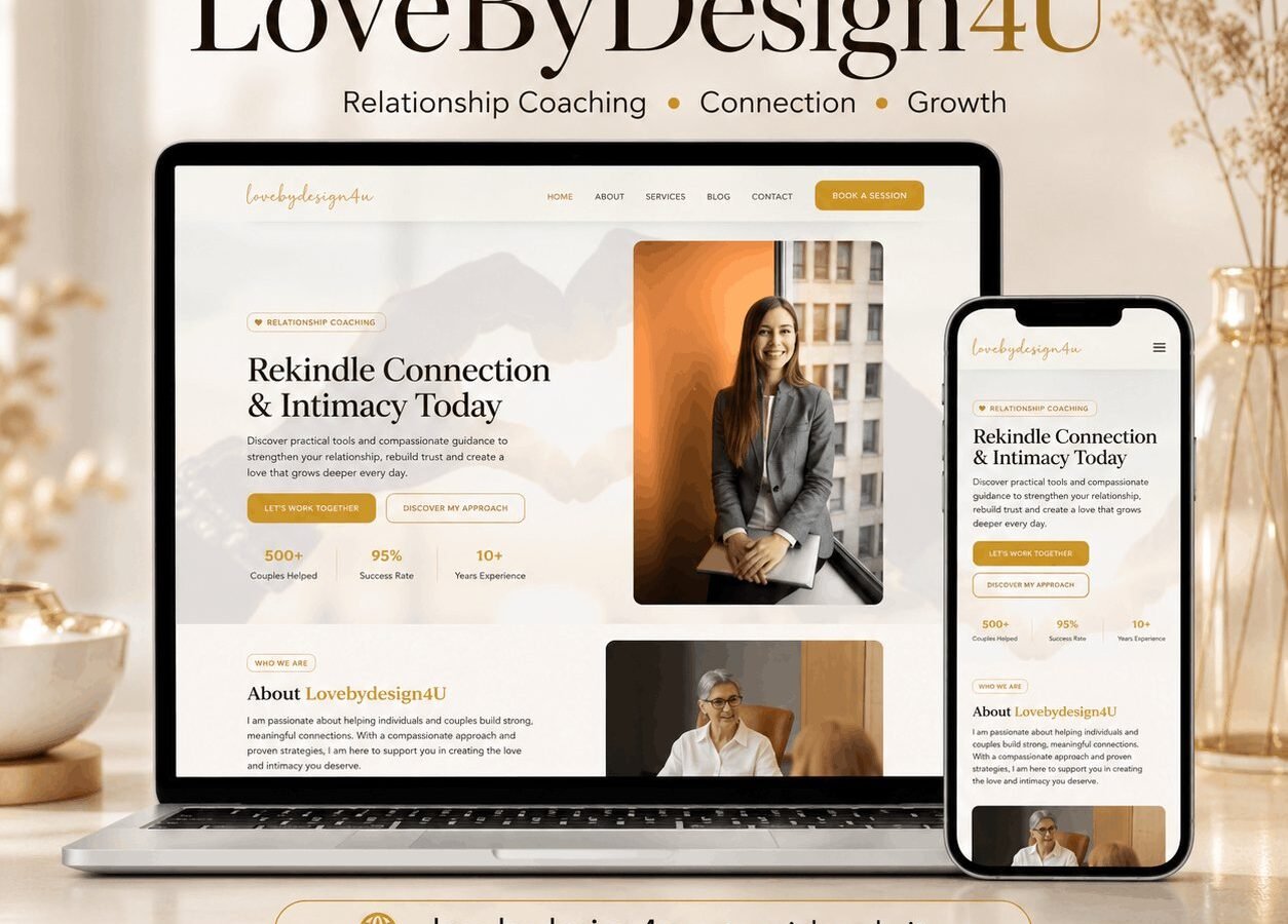
- Website for a relationship coaching practice|Warm editorial design in a soft gold-and-cream palette|Dual CTA structure: Let's Work Together and Discover My Approach|Trust bar: 500+ couples helped, 95% success rate, 10+ years experience
The brief
A relationship coaching practice. The site’s job is to move someone from considering coaching to booking a first conversation, in a category where the decision is private and often difficult to admit to.
The emotional problem
Someone reading a relationship coaching site is usually not in a good place, and they are frequently reading it without telling anyone. That has design consequences.
The copy does not open with a problem statement, because a reader in difficulty does not need their situation described back to them. It opens with what is possible, which is what they came looking for.
Nothing on the site requires an account, a quiz or an email address to see the substance. Gating content behind a form in this category reads as extractive, and the reader who is already unsure will simply leave.
Establishing credibility carefully
Coaching is unregulated in most jurisdictions, which means the field contains both serious practitioners and people who did a weekend course. A reader who is being careful with a sensitive decision knows this.
Qualifications, training and approach are stated specifically rather than gestured at. The methodology is named and explained in plain language, because a reader deciding whether this practitioner is right for them needs to know what the sessions actually involve, not that they are transformative.
The booking route
A first conversation rather than a purchase. The booking asks for a name, a contact address and a preferred time, and nothing about the situation. Asking someone to summarise their relationship difficulties in a web form before they have spoken to anyone is a reliable way to lose them.
The response time is stated, because a person who has just taken a difficult step needs to know when to expect an answer.
Privacy
More important here than on most sites. Nothing about a visitor’s behaviour is tracked beyond aggregate page views, the site sets no advertising cookies, and the enquiry form stores only what is needed to reply. That is stated on the page rather than buried in a policy.
Design
Warm, quiet, and generous with space. Photography is of the practitioner rather than of stock couples, because a reader is deciding whether they could talk to this specific person.
The build
WordPress with services, an approach section and a booking route. Session types are structured content, so adding one does not mean rebuilding a page.
What the client can manage
Services, availability, articles and the practitioner profile.
The stack
Next
More case studies
-
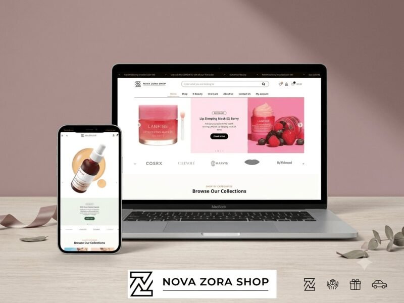
Nova Zora Shop
A WooCommerce store for authentic K-Beauty and skincare brands, built around category navigation and conversion.
-
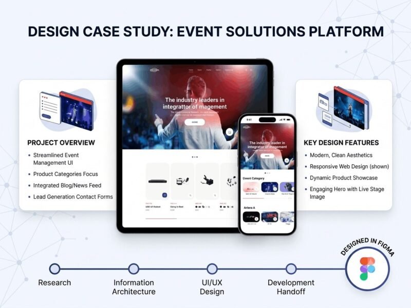
ABBN
A corporate site for a conference interpreting-equipment supplier, with a storefront and a full solutions site…
-
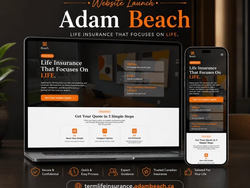
Adam Beach Term Life
A landing page for a Canadian term life insurance advisor, built around a three-step quote flow.
Ready to build something that performs?
Tell me about your project and I'll tell you exactly how I'd approach it. Free 30-minute consultation, and I reply within 24 hours.