
- GreenSingle accent
- AppDigital applied
The problem
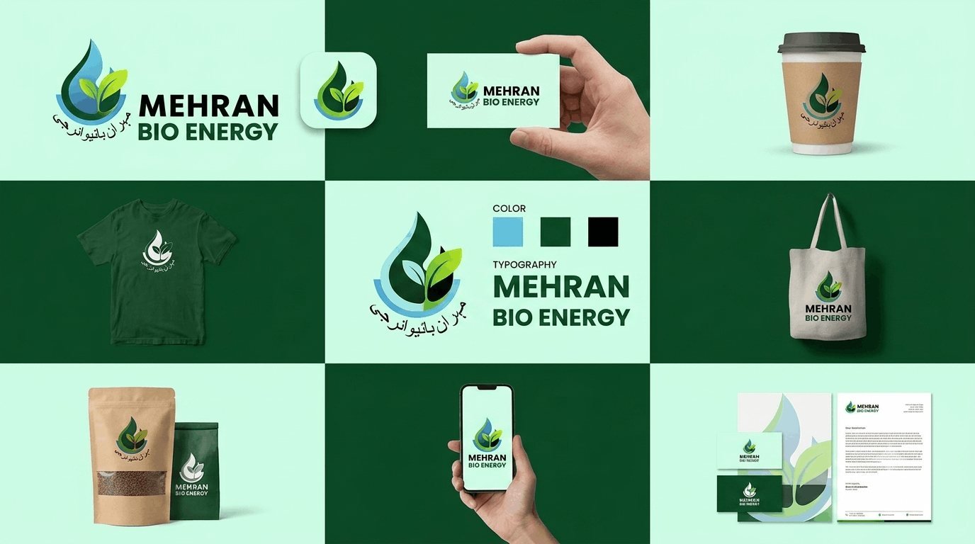
Energy branding defaults to green and a leaf. Using both is a cliché; avoiding both loses the category signal. The mark had to earn the green rather than assume it.
What I did
- Leaf mark constructed from a droplet, so it reads as both energy and organic
- Single green with a near-black, deliberately limited
- Business cards, cups and signage
- Mobile app screen and social templates
- Mark tested in one colour for embroidery and stamping
The brief
Brand identity for a bio energy company. The category has a visual cliché so entrenched that avoiding it entirely is as much of a problem as using it.
The green and leaf problem
Energy and environmental branding defaults to a green leaf. Using it means looking like every competitor; avoiding both green and any natural reference means losing the category signal that tells a viewer what the company does.
The approach here was to earn the green rather than assume it. The mark is built from a droplet that resolves into a leaf, which reads as both energy and organic depending on how it is held. It uses the category’s language without repeating its most tired form.
Palette
A single green with a near-black. One accent colour, deliberately limited, which reads as disciplined rather than as a company reaching for environmental credibility through colour alone.
The green is specified for print and screen separately, because the vivid green that works on a display turns dull in CMYK without a specified alternative.
Testing for reproduction
The mark was tested in one colour, reversed, embossed and embroidered before sign-off. Energy companies produce a great deal of physical material — vehicle livery, safety signage, workwear, cups — and much of it is reproduced by processes that cannot handle gradients or fine detail.
A mark that only works in full colour on screen is a mark that will be redrawn badly by a supplier within a year.
Applications
Business cards, cups, workwear, signage and a mobile app screen. The digital application matters increasingly in this sector, where customers track usage and billing through an app.
Typography
A clean sans throughout, with weight rather than a second face carrying the hierarchy. A single family keeps licensing simple for a company that will produce material through several suppliers.
What was delivered
Logo suite, single-colour and reversed variants, colour specifications for print and screen, application artwork and usage guidelines.
The stack
Next
More case studies
-
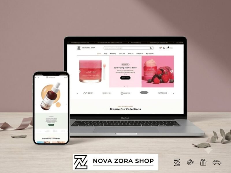
Nova Zora Shop
A WooCommerce store for authentic K-Beauty and skincare brands, built around category navigation and conversion.
-
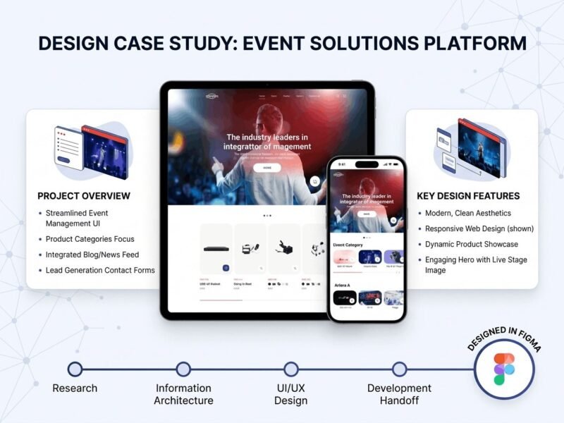
ABBN
A corporate site for a conference interpreting-equipment supplier, with a storefront and a full solutions site…
-
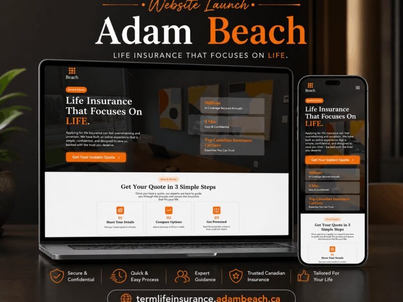
Adam Beach Term Life
A landing page for a Canadian term life insurance advisor, built around a three-step quote flow.
Ready to build something that performs?
Tell me about your project and I'll tell you exactly how I'd approach it. Free 30-minute consultation, and I reply within 24 hours.