
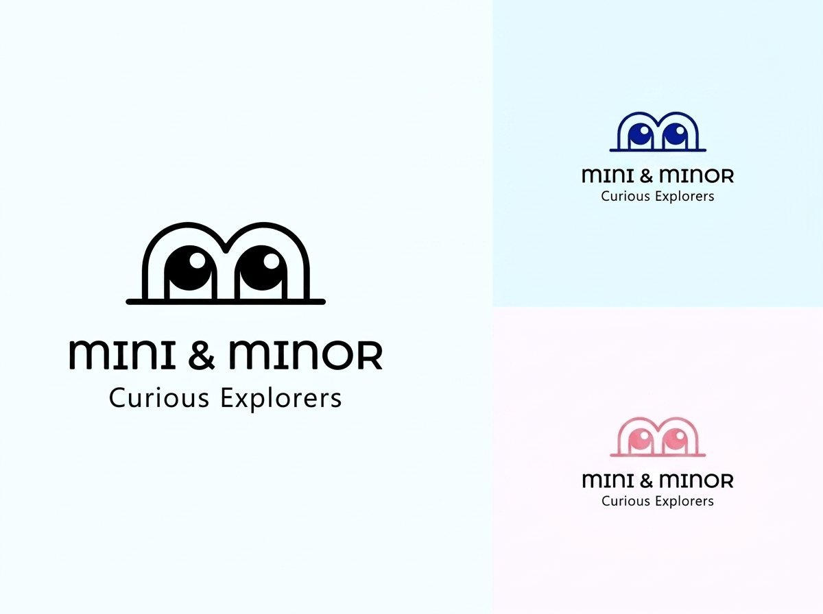
- 2Colourways
- EyesPrimary mark
The problem
A children's brand has to appeal to the parent buying and the child wearing it. Most solve this by going saccharine, which loses the parent.
What I did
- Mark built from a pair of eyes, readable as a face or a pair of binoculars
- Two colourways so the identity flexes across product lines
- Wordmark drawn to sit comfortably under the mark at small sizes
- Tagline lockup for packaging
The brief
Logo and identity for a children’s brand positioned as Curious Explorers.
The two-audience problem
Children’s brands are chosen by parents and used by children, and the two want different things. Most solve it by going saccharine, which appeals to neither: children find it patronising and parents find it embarrassing.
The position here is curiosity rather than cuteness. It gives the brand somewhere to go as the child grows, and it gives the parent something they are happy to be seen carrying.
The mark
A pair of eyes above the wordmark, readable as a face or as binoculars depending on how you look at it. That ambiguity is the point: it is playful without being a cartoon, and it carries the explorer idea without illustrating it.
Constructed from simple geometry so it survives every application a children’s brand needs: embroidered on a garment, printed on a label, stamped on packaging, rendered at 40 pixels as a profile picture.
Colourways
Two, in blue and pink, and deliberately not assigned to gender. They exist so the identity can flex across product lines and seasons. A single fixed colourway is limiting for a brand that will extend into apparel, accessories and print.
Typography
A rounded lowercase for the name with a lighter weight for the tagline. Lowercase is friendlier and, more practically, keeps the wordmark compact under a mark that is wider than it is tall.
Testing
The mark was tested at 40 pixels, in one colour, and reversed out of a dark ground before sign-off. Those three tests catch most of the problems that otherwise surface after the identity has been rolled out.
What was delivered
Logo suite in both colourways, single-colour and reversed variants, clear space and minimum size rules, and application artwork.
The stack
Next
More case studies
-
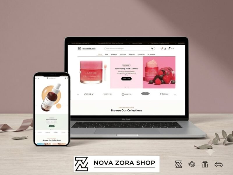
Nova Zora Shop
A WooCommerce store for authentic K-Beauty and skincare brands, built around category navigation and conversion.
-
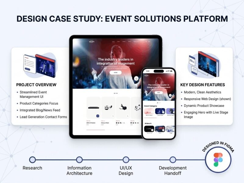
ABBN
A corporate site for a conference interpreting-equipment supplier, with a storefront and a full solutions site…
-
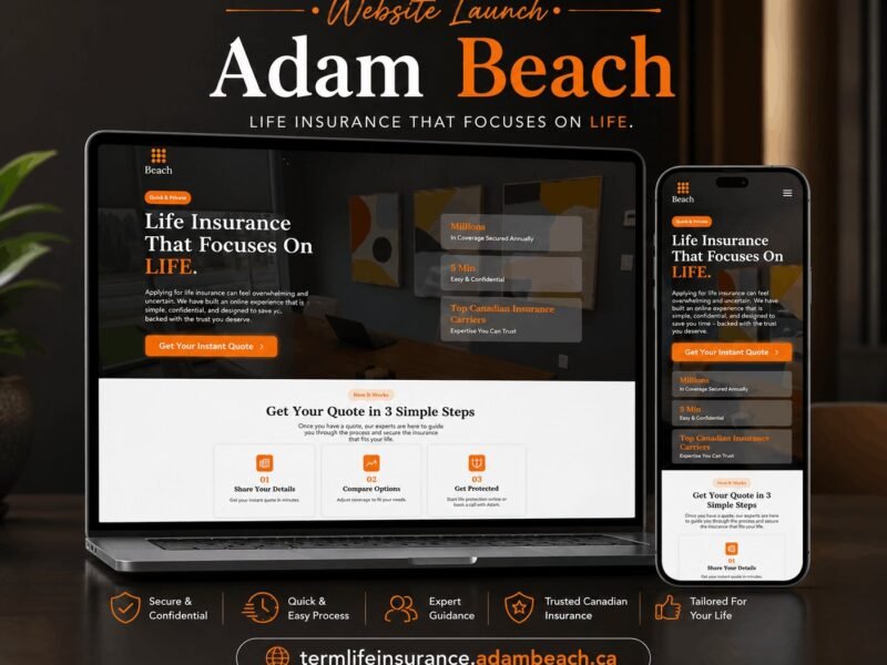
Adam Beach Term Life
A landing page for a Canadian term life insurance advisor, built around a three-step quote flow.
Ready to build something that performs?
Tell me about your project and I'll tell you exactly how I'd approach it. Free 30-minute consultation, and I reply within 24 hours.