
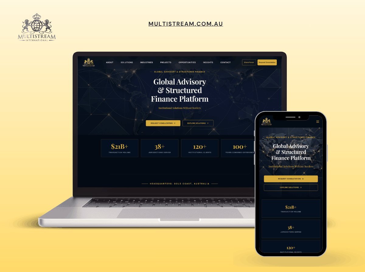
- $21B+Transaction volume
- Gold CoastBase
- FinanceSector
The problem
Institutional finance buyers judge credibility in the first five seconds, and the numbers had to lead.
What I did
- Website for an institutional advisory and structured finance platform|Elegant navy-and-gold identity with a world-map hero background|Key stats: $21B+ transaction volume, 38+ jurisdictions, 120+ institutional clients|Headquartered on the Gold Coast, Australia, fully responsive design
The brief
Multistream International advises on structured finance from the Gold Coast. The audience is institutional: fund managers, corporate treasurers and the advisers who recommend them. These are people who will read a site carefully, once, and decide from it whether the firm is worth a meeting.
What institutional buyers look for
Not enthusiasm. Not a promise of returns. They look for evidence that the firm understands the instruments it advises on, that it has handled transactions at a comparable scale, and that it is regulated where it says it is.
That last point shapes more of the site than it might seem. Financial services sites operate under advertising rules that vary by jurisdiction, and a claim written casually can create a compliance problem. Every figure on the site is stated as a fact about past activity rather than as an implied forecast, and the language avoids anything that could be read as advice or as a projection.
Design for credibility
Dark, restrained, and almost entirely typographic. The sector’s visual conventions exist for a reason: a finance site that reaches for bright colour and playful illustration reads as a startup, and a fund manager reading it will file it accordingly.
The transaction volume figure is given prominence because it is the single most useful number for the reader. It answers the first question an institutional visitor has, which is whether this firm operates at their scale, and it does so before they have to hunt for it.
Photography is of the location rather than of people. Stock photography of handshakes and boardrooms is instantly recognisable and actively harms credibility in this sector, because every competitor uses the same three images.
The build
WordPress with a content structure that separates transaction records, service descriptions and team profiles into their own types. Each has its own template and its own fields, which keeps the language consistent as content is added.
The team profiles carry qualifications and regulatory registrations as structured fields rather than as free text, so they render identically across every profile. In a regulated sector, a qualification written three different ways across three profiles is the sort of inconsistency a compliance review flags.
Performance and access
Institutional users often browse from corporate networks with strict security policies and older browsers. The site is built to work without JavaScript for everything that matters: navigation, content, and the contact route. Animation is an enhancement that adds nothing a reader needs.
Contrast ratios are tested rather than assumed. Dark interfaces fail accessibility more often than light ones, because a mid-grey that looks acceptable to a designer on a calibrated screen is unreadable on a laptop in a bright room.
What the client can manage
Transactions, team members, insights and service pages. The compliance-sensitive language sits in templates rather than in editable fields, so routine content updates cannot accidentally introduce a claim that needs legal review.
The stack
Next
More case studies
-
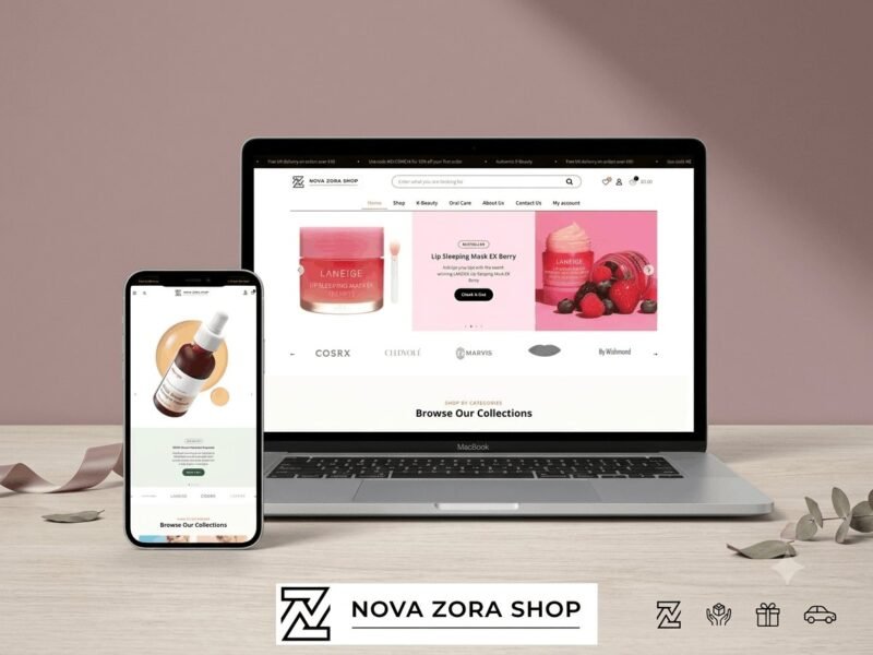
Nova Zora Shop
A WooCommerce store for authentic K-Beauty and skincare brands, built around category navigation and conversion.
-
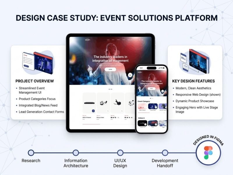
ABBN
A corporate site for a conference interpreting-equipment supplier, with a storefront and a full solutions site…
-
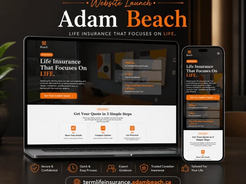
Adam Beach Term Life
A landing page for a Canadian term life insurance advisor, built around a three-step quote flow.
Ready to build something that performs?
Tell me about your project and I'll tell you exactly how I'd approach it. Free 30-minute consultation, and I reply within 24 hours.