
- MonogramPrimary mark
- SignageIncluded
The problem
Property development sells on trust before it sells on product. The identity had to look like an organisation that finishes what it starts.
What I did
- NUD monogram with the full name locked beneath it
- Navy and warm grey, with no accent colour, deliberately restrained
- Business cards, presentation folders and interior signage
- Digital applications including a watch face and app icon
- Grid system so future collateral stays consistent
The brief
Corporate identity for an urban property developer. Development is sold on confidence: buyers and investors are committing to something that does not exist, on the strength of the developer’s ability to finish it.
What the identity has to communicate
Competence and permanence. Not innovation, not disruption, not energy. A developer who looks like a startup raises exactly the question a buyer is trying to suppress, which is whether the project will be completed.
The mark
An NUD monogram with the full name locked beneath it. Monograms suit developers because the initials appear on hoardings, plaques and signage where a full name would be unreadable at distance.
Constructed on a strict grid, with the letterforms sharing strokes so the monogram reads as one form rather than three letters pushed together.
Palette
Navy and warm grey, with no accent colour at all. That restraint is the identity’s main statement. Development branding reaches for an accent to signal energy, and the absence of one reads as an organisation that does not need to.
Applications
Business cards, presentation folders, hoardings and interior signage, plus digital: an app icon and a watch face. That last pair is not decoration; developers increasingly manage sales and site access through apps, and an identity that has not been designed for a small round crop will be cropped badly by someone else.
The grid
A layout grid was delivered alongside the mark, which is the part of an identity most often omitted and most needed. Developers produce a great deal of collateral over a project’s life, much of it by different people. A grid is what keeps the twentieth brochure looking like the first.
What was delivered
Logo suite, monogram variants, layout grid, print and digital artwork, signage specifications and usage guidelines.
The stack
Next
More case studies
-
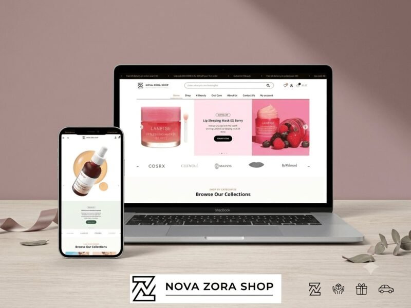
Nova Zora Shop
A WooCommerce store for authentic K-Beauty and skincare brands, built around category navigation and conversion.
-
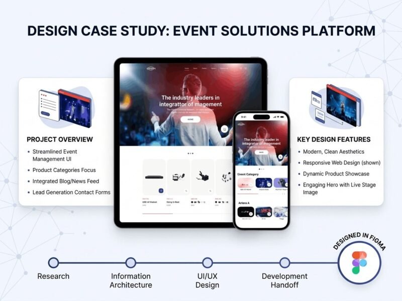
ABBN
A corporate site for a conference interpreting-equipment supplier, with a storefront and a full solutions site…
-
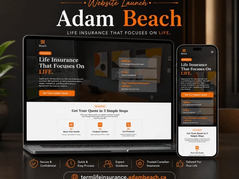
Adam Beach Term Life
A landing page for a Canadian term life insurance advisor, built around a three-step quote flow.
Ready to build something that performs?
Tell me about your project and I'll tell you exactly how I'd approach it. Free 30-minute consultation, and I reply within 24 hours.