
- PackagingIncluded
- TerracottaPalette base
The problem
Homeware sells on texture and restraint. An identity that shouts undermines the product it sits on, so the mark had to feel handmade without looking amateur.
What I did
- Wordmark set in a serif with hand-finished terminals
- Muted terracotta and sage palette taken from the products themselves
- Packaging, labels and swing tags
- Social templates and a product photography direction
- Type pairing documented with licensing notes
The brief
Identity and packaging for an artisanal homeware brand. The products are candles, linens and small home objects, sold on texture and restraint.
The tension
Handmade brands have to look handmade without looking amateur, and the gap between those is narrow. Too polished and the artisanal claim collapses; too rough and the price cannot be justified.
The answer here was precision in the structure and warmth in the detail: a carefully constructed monogram, set against materials and a palette that carry the handmade quality. The craft is in the making, and the identity should look like it was made by someone who knows what they are doing.
The mark
An O and A overlapped into a single form that reads as both letters and as an object. It works as a standalone icon on a candle lid where the full name would not fit, which is the practical test for a homeware brand.
Palette
Forest green, terracotta, sand and copper. Drawn from the products themselves rather than chosen first and applied afterwards, which is why the packaging sits with the product instead of against it.
Typography
Aurora Sans with Avenir Next for information, Artisan Serif with Bodoni 72 for display. Four faces is more than most identities need, but a homeware brand runs across packaging, labels, swing tags, social and retail, and each context has different constraints.
Packaging
The main deliverable. Candle vessels, boxes, labels and swing tags, each specified with material and finish rather than only as artwork. An unspecified finish is decided by whoever prints it, and the result is rarely what was intended.
Digital
Store and social templates using the same system, so the online presence matches what arrives in the box. That consistency is most of what makes a small brand feel considered.
What was delivered
Logo suite, packaging artwork, colour and material specifications, type licensing notes, social templates and usage guidelines.
The stack
Next
More case studies
-
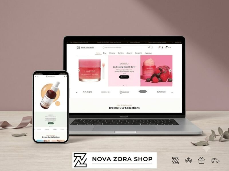
Nova Zora Shop
A WooCommerce store for authentic K-Beauty and skincare brands, built around category navigation and conversion.
-
ABBN
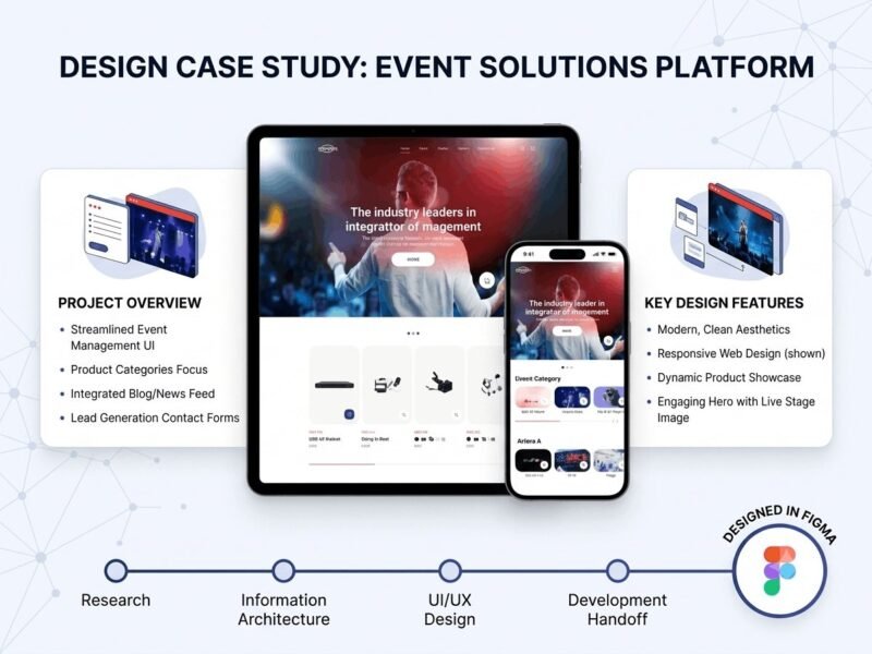
A corporate site for a conference interpreting-equipment supplier, with a storefront and a full solutions site…
-
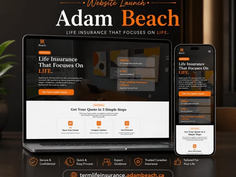
Adam Beach Term Life
A landing page for a Canadian term life insurance advisor, built around a three-step quote flow.
Ready to build something that performs?
Tell me about your project and I'll tell you exactly how I'd approach it. Free 30-minute consultation, and I reply within 24 hours.