
- UKMarket
- PlatformBuild type
The problem
Three unrelated service categories in one hub risked feeling like three different websites stapled together.
What I did
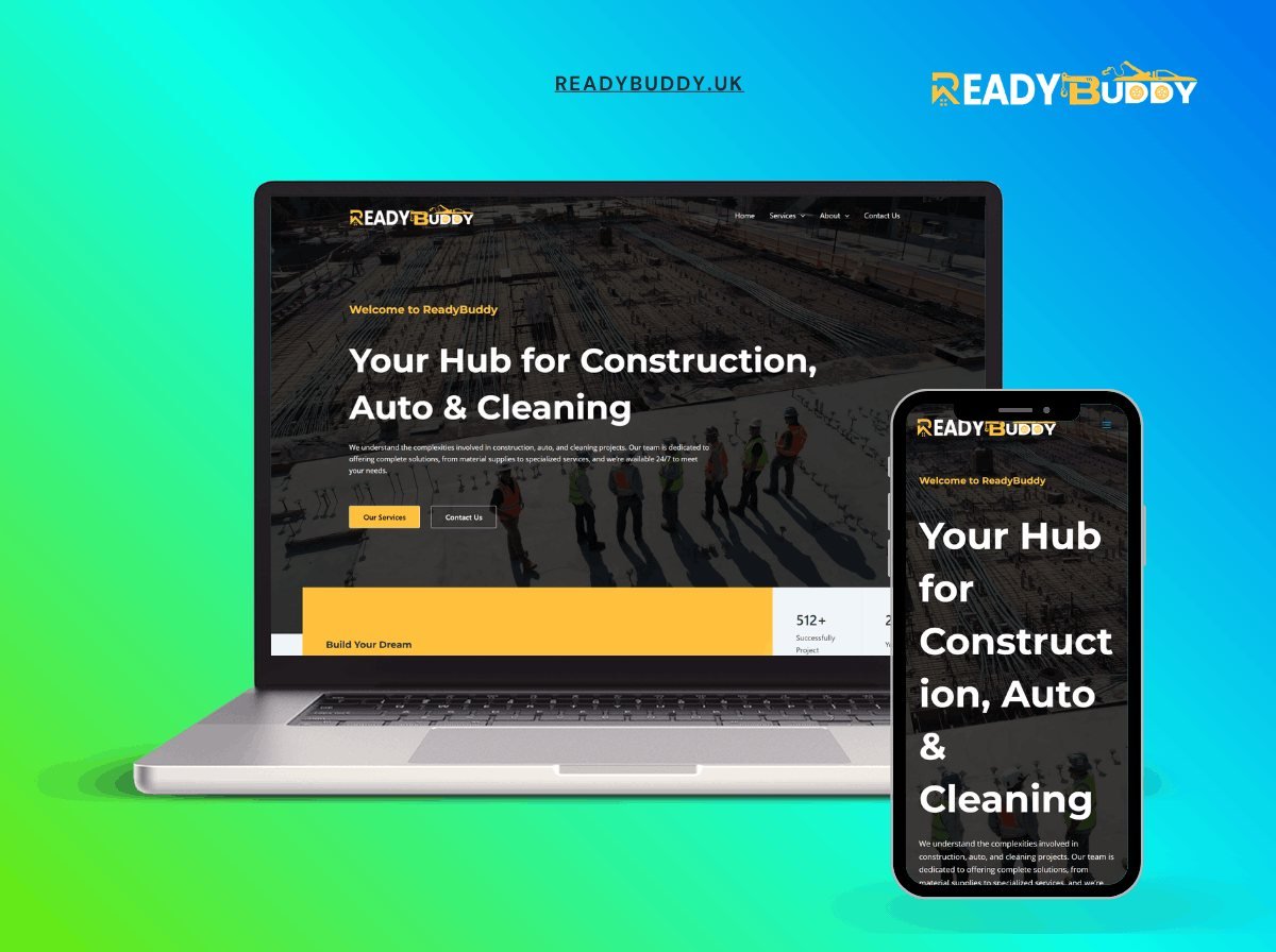
- Hub site connecting customers with construction, auto and cleaning service providers|Bold black-and-amber brand identity with full-bleed job-site photography|Stats bar highlighting 512+ successfully completed projects|Fully responsive with a matching mobile experience
The brief
ReadyBuddy is a hub connecting customers with construction, automotive and cleaning services. A marketplace, which is a harder problem than a brochure site because it has to work for two sides at once.
The two-sided problem
A customer wants to find a trustworthy provider quickly. A provider wants leads worth paying attention to. Those goals conflict at the point of contact: the customer wants to give as little information as possible, the provider wants as much as possible.
The resolution is to ask the customer only for what determines whether a provider can help at all — the service, the location and the timeframe — and to leave everything else to the conversation. A form that asks twelve questions gets abandoned; a form that asks three produces a lead a provider can act on.
Categories that match how people search
Three sectors that share almost nothing operationally. Grouping them under generic headings would make the site useless for all three.
Each has its own category tree built from how customers describe the job rather than how the trade classifies it. Someone with a leaking roof searches for a leaking roof, not for a roofing contractor specialising in flat membrane systems.
Provider profiles
Each provider has a real page with services, area, credentials and reviews. That page is the unit of trust, and it needs to be linkable and indexable: a provider who can share their profile has a reason to promote the platform.
Trust and verification
The weak point of every marketplace. Verification status is stated explicitly and what it means is explained, rather than implied by a badge. A badge with no explanation is worth nothing to a customer who does not already know the platform.
The build
WordPress with providers, services and locations as connected content types. A provider’s services and coverage are structured data, so search filters on real values rather than on free text somebody typed.
Local search
Nearly all traffic is location-plus-service. Location pages are generated from real provider coverage rather than from a template with place names substituted, which is a pattern search engines have devalued for years.
Performance
Search results are server-rendered and paginated, so the page stays fast as the directory grows and every result set has a real URL.
What the client can manage
Providers, services, categories and verification status.
The stack
Next
More case studies
-
Nova Zora Shop
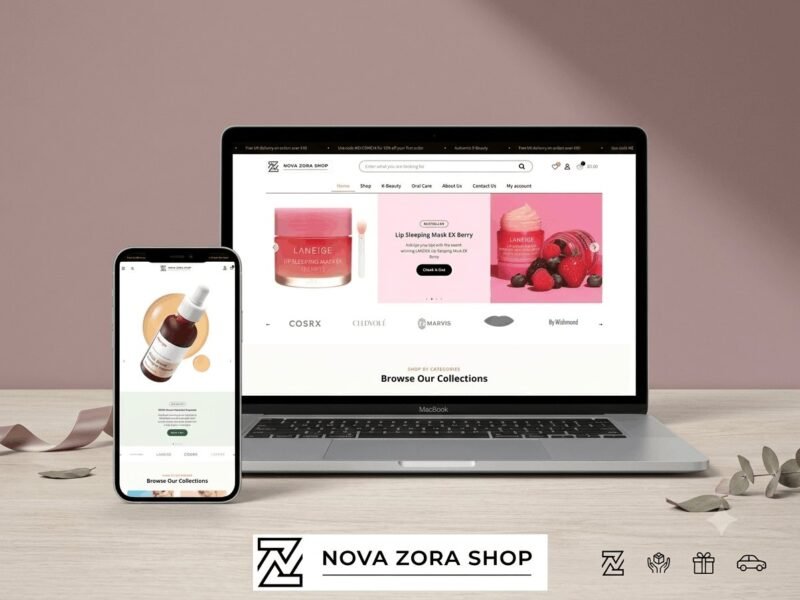
A WooCommerce store for authentic K-Beauty and skincare brands, built around category navigation and conversion.
-
ABBN
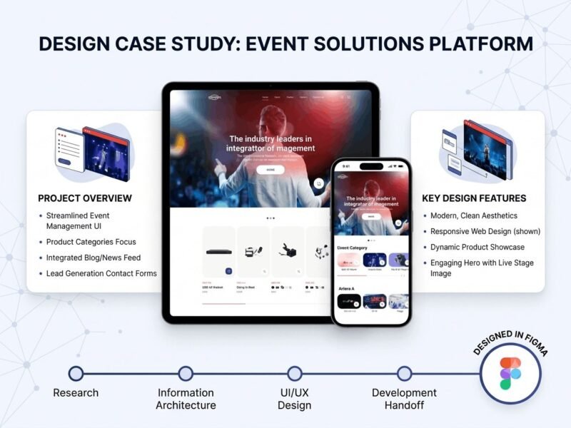
A corporate site for a conference interpreting-equipment supplier, with a storefront and a full solutions site…
-
Adam Beach Term Life
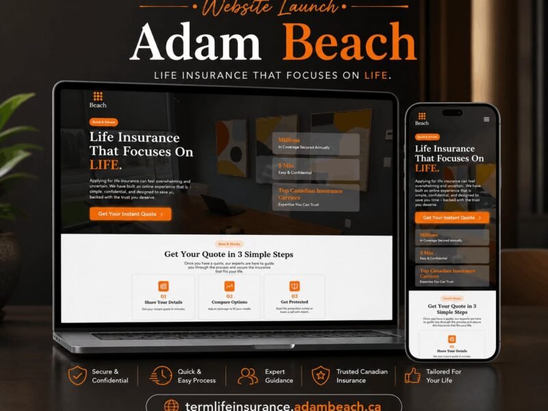
A landing page for a Canadian term life insurance advisor, built around a three-step quote flow.
Ready to build something that performs?
Tell me about your project and I'll tell you exactly how I'd approach it. Free 30-minute consultation, and I reply within 24 hours.