
- Navy + copperPalette
- PackagingIncluded
The problem
Scientific products have to look precise without looking cold. Most identities in the category pick one and lose the other.
What I did
- Wordmark set in a technical sans, tightly tracked
- Deep navy with copper, so the range reads as premium rather than clinical
- Dropper bottle and carton packaging
- Brochure and specification sheet templates
- Photography direction for the product range
The brief
Identity and packaging for a scientific products company. The category demands precision, and most brands in it achieve precision by becoming cold.
Precise without being clinical
Laboratory and scientific branding defaults to white, blue and a sans-serif, which is legible and forgettable. The buyer is technical and will judge on specification, but the purchase decision is still made by a person who prefers dealing with a company that appears considered.
The identity holds precision in the structure — a strict grid, tight tracking, exact alignment — while the palette does the warming.
Palette
Deep navy with copper. Copper is the departure: it carries a laboratory association through instrumentation while reading as premium rather than institutional. Used as a foil on packaging, it is the element that makes the range look expensive on a shelf next to white boxes.
The mark
A geometric monogram built from interlocking forms, referencing molecular structure without illustrating a molecule. Literal molecular marks are the category cliché and they date quickly.
Typography
A technical sans, tightly tracked, with Bodoni for display. The tight tracking is doing specific work: it reads as engineered, and it keeps long product names compact enough for small labels.
Packaging
Dropper bottles, cartons and a brush set, each specified with substrate and finish. Dropper bottles are particularly unforgiving — curved, small, and carrying required regulatory text — so the label system was designed around the smallest item in the range rather than the largest.
Documentation
Brochure and specification sheet templates, because a scientific products company generates a continuous stream of technical documents. Without templates those documents drift, and drifting documentation undermines a precision claim faster than anything on the packaging.
What was delivered
Logo suite, packaging artwork, material and finish specifications, document templates, photography direction and usage guidelines.
The stack
Next
More case studies
-
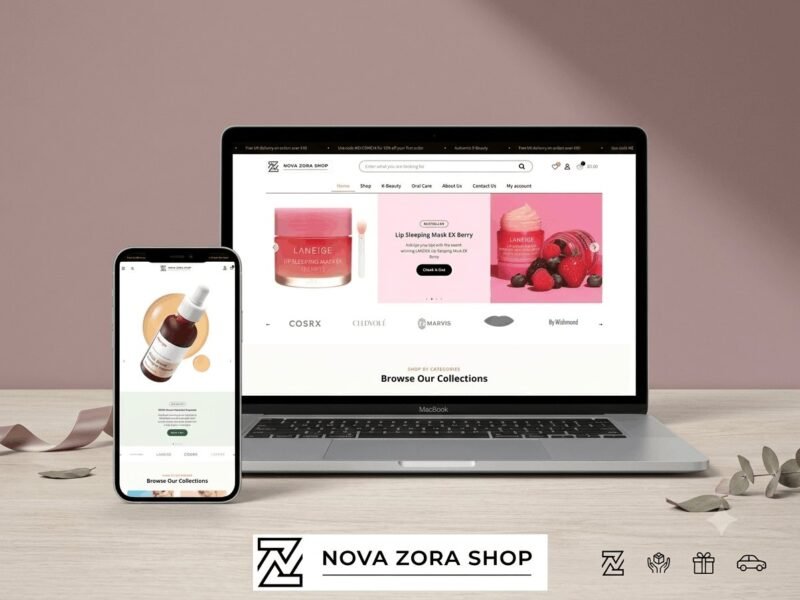
Nova Zora Shop
A WooCommerce store for authentic K-Beauty and skincare brands, built around category navigation and conversion.
-
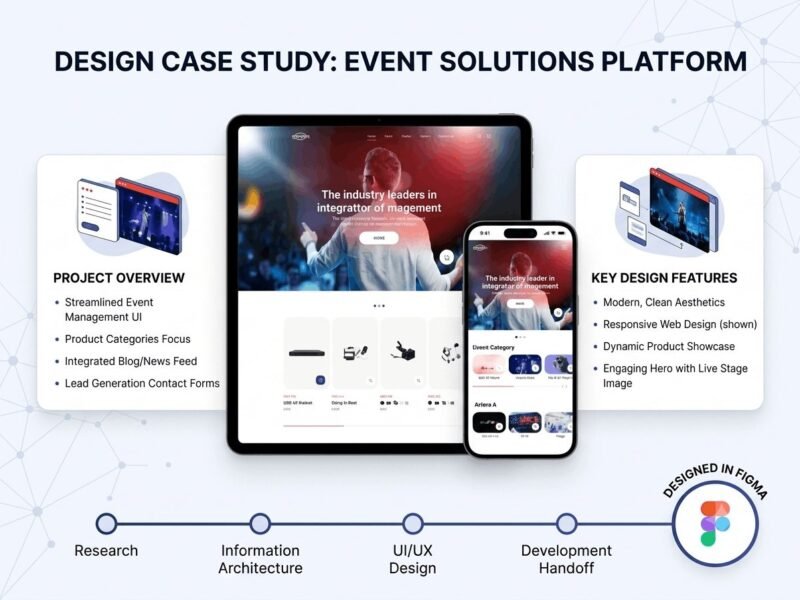
ABBN
A corporate site for a conference interpreting-equipment supplier, with a storefront and a full solutions site…
-
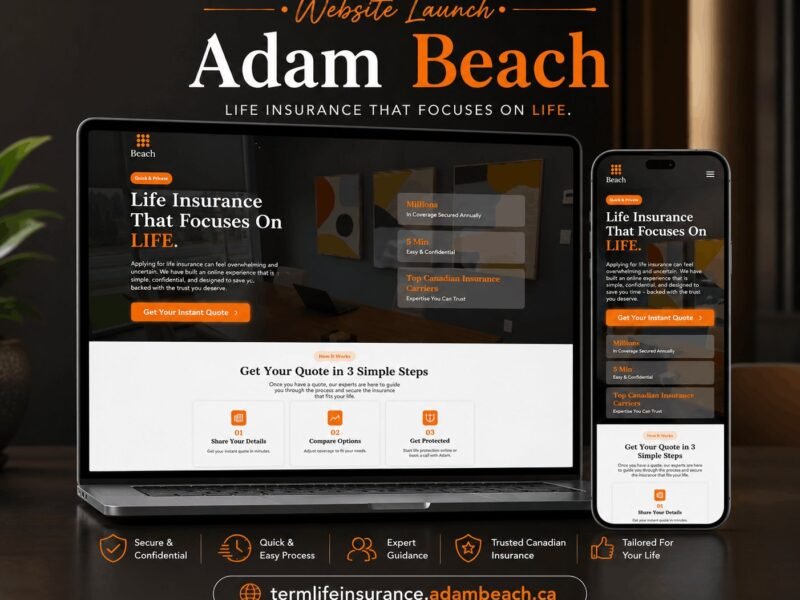
Adam Beach Term Life
A landing page for a Canadian term life insurance advisor, built around a three-step quote flow.
Ready to build something that performs?
Tell me about your project and I'll tell you exactly how I'd approach it. Free 30-minute consultation, and I reply within 24 hours.