
- ArchPrimary motif
- Lora + CormorantTypography
The problem
The brief called for something that felt grounded and permanent without reaching for the obvious environmental clichés of green and leaves.
What I did
- Arch mark that works as a logo, a frame and a repeating pattern
- Earth-toned palette: clay, olive and warm stone
- Lora Regular with Cormorant Medium
- Notebooks, cards, mugs and signage
- Pattern system derived from the mark itself
The brief
Brand identity for TerraForm, an architecture studio. Architecture branding has a particular difficulty: the audience is design-literate and will judge the identity as work.
The mark
An arch, drawn to work three ways: as a logo, as a frame around imagery, and as a repeating pattern. Architecture marks often reduce a building to an outline, which is both common and limiting.
An arch carries structure and permanence while remaining abstract enough not to describe any particular building, which matters for a studio whose work varies.
Palette
Clay, olive and warm stone. The obvious route for an architecture practice is monochrome, which is safe and says nothing. These are material colours, drawn from what the studio builds with, and they let the identity sit alongside project photography without competing.
Typography
Lora Regular with Cormorant Medium. Two serifs, which is unusual: the pairing gives a bookish, considered quality suited to a practice that documents its thinking, and avoids the technical-sans default that most architecture studios reach for.
The pattern system
Derived from the arch rather than designed separately. A pattern developed independently of the mark tends to feel bolted on; one built from the mark’s geometry extends the identity into large surfaces — endpapers, packaging, hoardings — without introducing a new element.
Applications
Notebooks, a leather folio, drawing tubes, signage and digital. Architecture practices hand things to clients, and the physical items carry disproportionate weight in how the practice is perceived.
Material specification
Papers, finishes and leather specified rather than left to the supplier. For a practice whose work is about materials, an identity printed on whatever was cheapest would undermine the argument.
What was delivered
Logo suite, pattern system, colour and material specifications, type licensing notes, application artwork and usage guidelines.
The stack
Next
More case studies
-
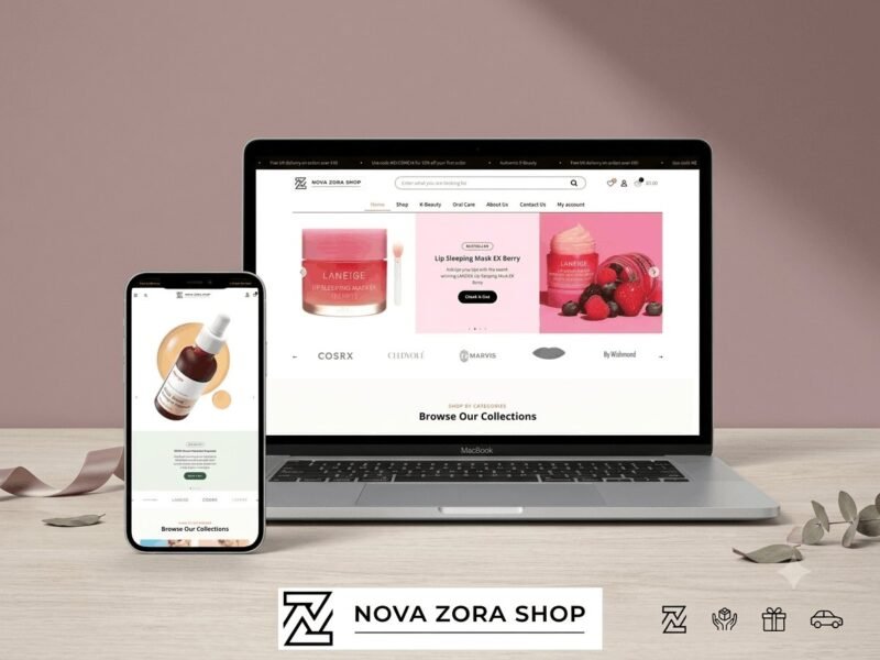
Nova Zora Shop
A WooCommerce store for authentic K-Beauty and skincare brands, built around category navigation and conversion.
-
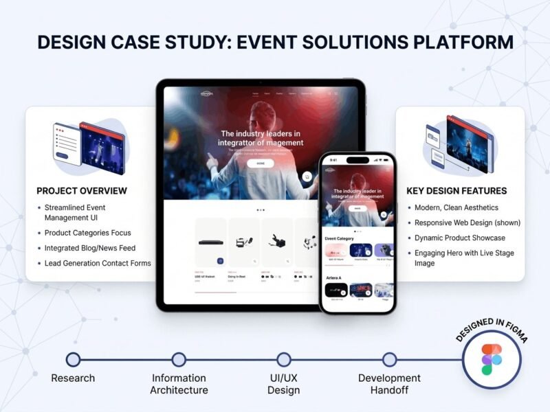
ABBN
A corporate site for a conference interpreting-equipment supplier, with a storefront and a full solutions site…
-
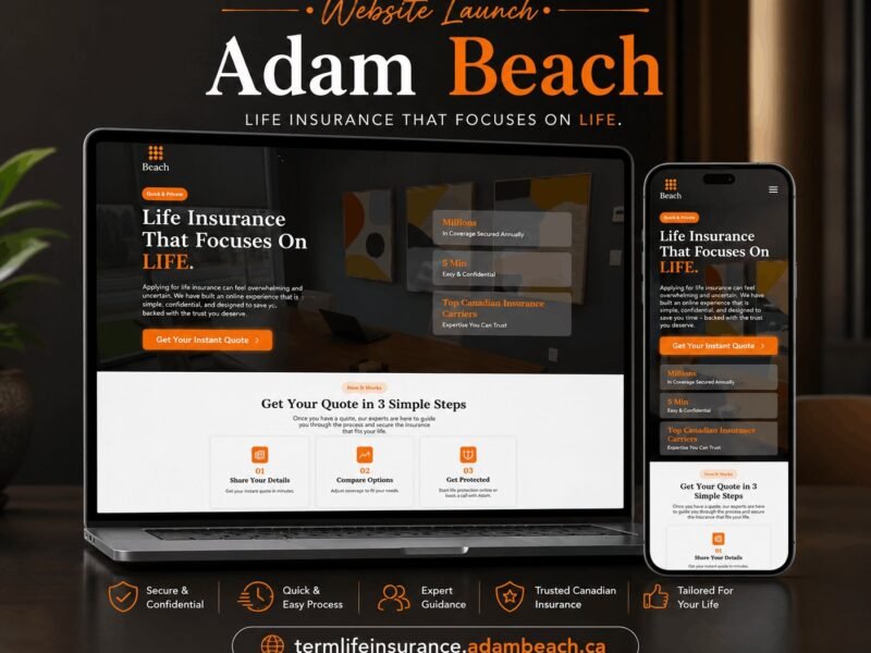
Adam Beach Term Life
A landing page for a Canadian term life insurance advisor, built around a three-step quote flow.
Ready to build something that performs?
Tell me about your project and I'll tell you exactly how I'd approach it. Free 30-minute consultation, and I reply within 24 hours.